Sony has always been more than a technology company. It’s a brand that makes people feel something—whether through the cinematic sweep of a Bravia TV, the immersive sound of its audio gear, or the magic of its gaming worlds. But its e-commerce site wasn’t telling that story. It functioned well enough, but it didn’t carry the emotion, elegance, or cohesion that defined Sony’s products. Our redesign set out to change that—transforming the store from a utilitarian catalog into an immersive, brand-led experience.
The Challenge
The existing Sony Store was product-centric to a fault. Technical specifications dominated, leaving little room for storytelling or brand personality. Each product category—TVs, audio, cameras, gaming—felt isolated, lacking a sense of connection within Sony’s ecosystem. Navigation was complex, imagery felt generic, and mobile responsiveness lagged behind the expectations of a brand known for its design leadership. The challenge was to create a unified, emotionally engaging storefront that matched Sony’s premium identity and inspired exploration.
My Role
I led the design execution, guiding the project through high-fidelity design. This included conducting brand and UX audits, mapping user flows, creating responsive wireframes, and designing a cohesive visual system that could scale across campaigns. I collaborated closely with Sony’s internal creative and development teams to ensure the redesign honored their brand standards while delivering measurable improvements in usability and conversion.
Approach
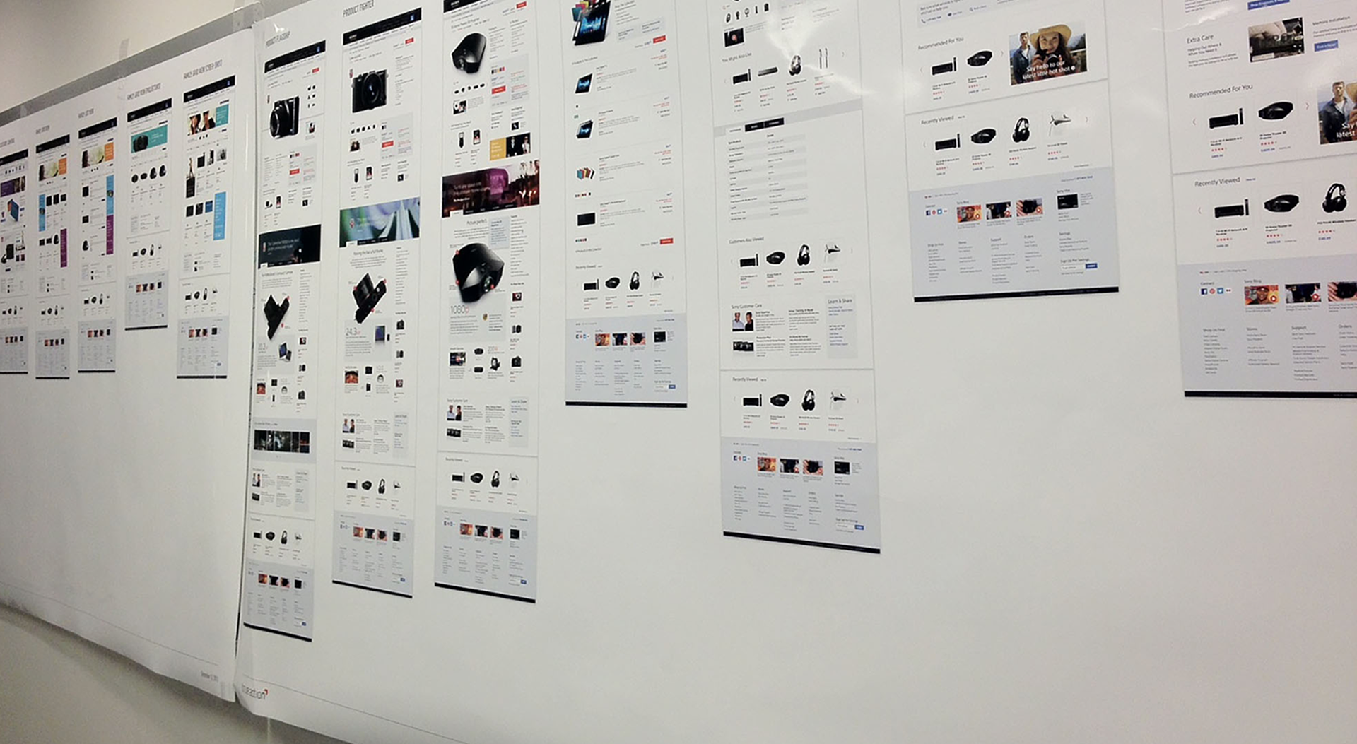
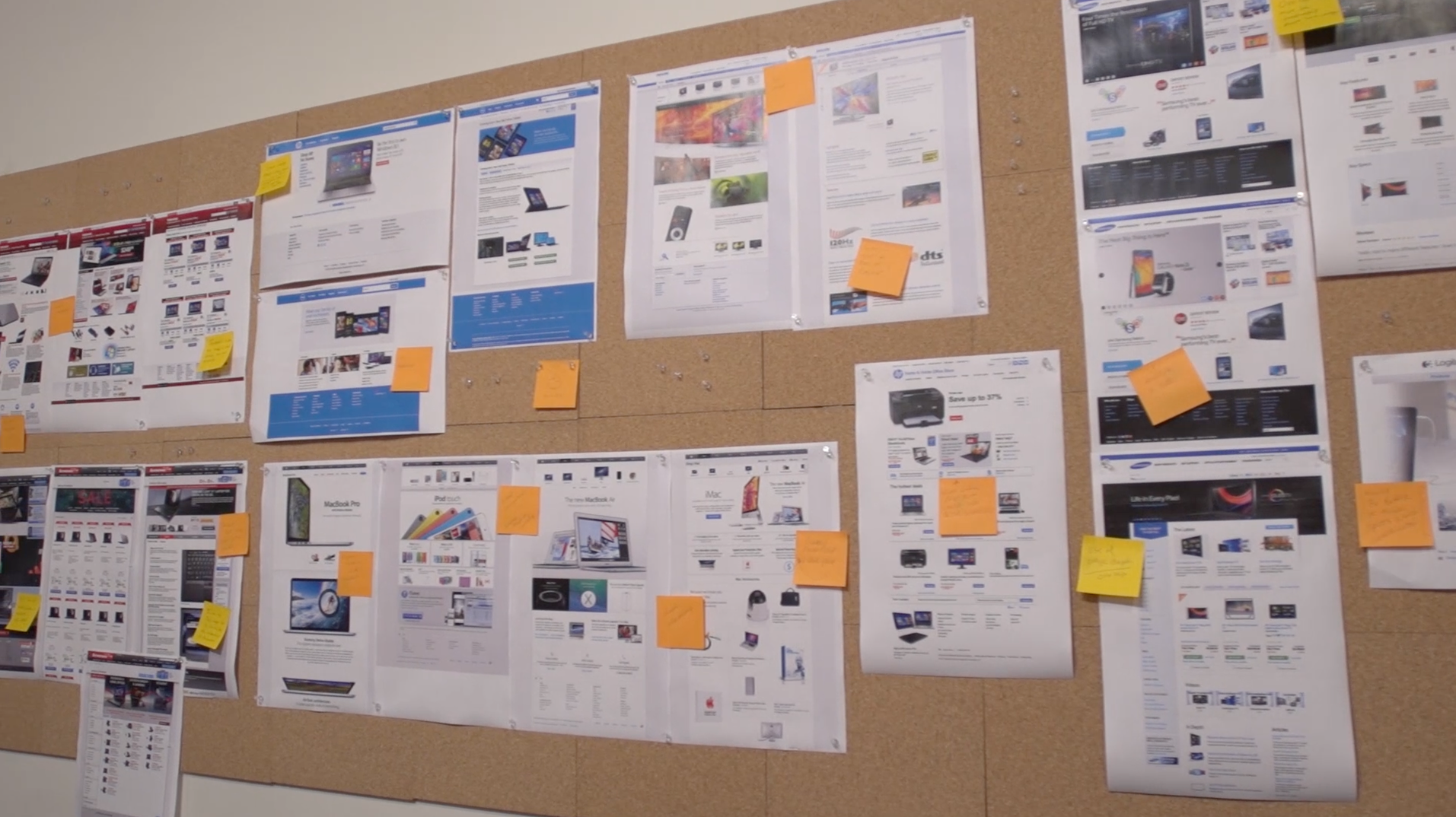
We began with a deep dive into Sony’s brand values—innovation, elegance, and the joy of entertainment—and mapped them against user needs identified through analytics, heatmaps, and feedback. This dual perspective informed a lifestyle-driven design direction. Instead of leading with specs, we led with stories: a family gathered for movie night, a photographer capturing a fleeting moment, a gamer lost in another world. Wireframes evolved into flexible, responsive layouts that wove these narratives into the shopping journey. Navigation was restructured into a unified mega-menu, making it easy to explore across categories. Product pages became visual showcases, balancing immersive photography with clear, scannable information.
Design
That’s where the redesign began: with a question of emotion. What if the store could feel like walking into a curated gallery of everyday moments elevated by technology? What if it could show you the living room during a family movie night, where the Bravia screen glows in the dark? Or a quiet desk lit by afternoon sun, anchored by sleek headphones and a minimalist VAIO? The solution was to lean hard into lifestyle design—not in the trendy sense, but in a way that tethered products to possibilities. It became a site about how people use Sony—not just what they can buy.
The approach started with a deep brand and user audit. It was important to understand not just what people were clicking, but what they were feeling. From there, image-forward layouts were created that let rich photography and subtle motion guide the user. Categories became less siloed and more interconnected. Browsing a camera didn’t end in specs; it opened the door to lenses, accessories, video editing software, even headphones for the post-production process. The whole ecosystem started to make sense.
Design decisions were driven by clarity and intention. The color palette was restrained, letting product images pop. Typography was modern and readable, with enough variation to create hierarchy without overwhelming the viewer. Product pages were given room to breathe, supported by lifestyle images that told stories alongside technical specs. Even the iconography was refined to match the elegance of Sony’s industrial design. Everything had to feel premium—because that’s what Sony is.
Testing and Iteration
This project reinforced the power of emotional storytelling in e-commerce. By shifting from a purely product-driven layout to one rooted in lifestyle and brand values, we transformed the Sony Store into an experience that both informs and inspires. The modular design system we built continues to give Sony’s teams the flexibility to evolve with trends and campaigns while maintaining a consistent, premium feel. In the end, the redesign wasn’t just about selling more products–it was about showing what life feels like with Sony.
Outcome
The redesigned Sony Store launched as a digital flagship worthy of the brand. Engagement metrics climbed, session durations increased, bounce rates dropped, and cross-category browsing became more common. Internally, Sony’s creative and marketing teams praised the site’s cohesion and flexibility, noting how much easier it was to align seasonal campaigns with the overall brand vision. The new design didn’t just improve the shopping experience; it strengthened Sony’s online identity.


Reflection
This project reinforced the power of emotional storytelling in e-commerce. By shifting from a purely product-driven layout to one rooted in lifestyle and brand values, we transformed the Sony Store into an experience that both informs and inspires. The modular design system we built gave Sony’s commerce teams the flexibility to evolve with trends and campaigns while maintaining a consistent, premium feel. In the end, the redesign wasn’t just about selling more products, it was about showing what life feels like with Sony.


